When we were first presented with the task to keep a visual journal I really wasn't sure what I was supposed to be putting in it. I knew we weren't supposed to just be illustrating our essay, but I was a bit confused as to how else I would respond visually to the module??
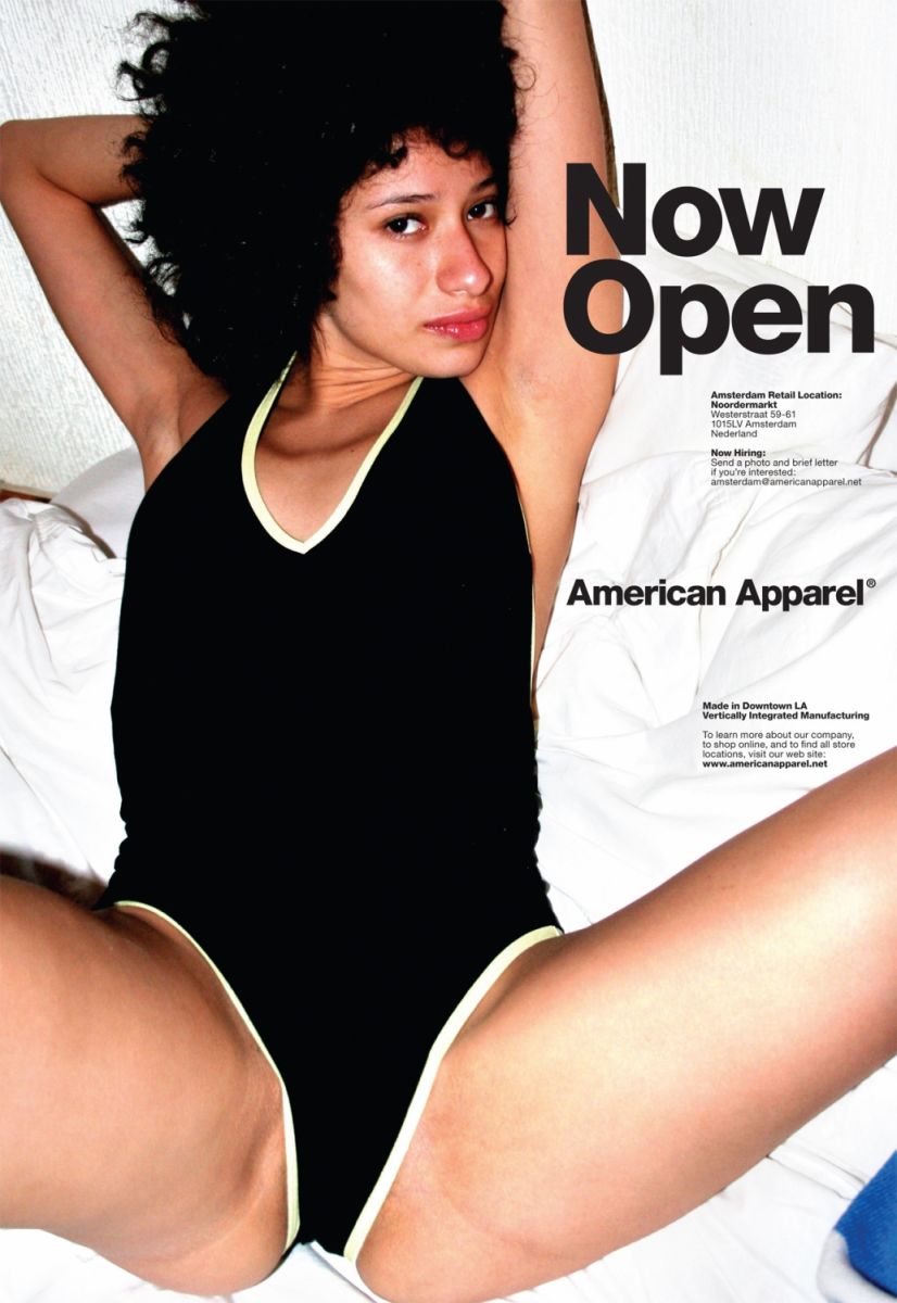
I admit I hadn't really done much in the way of visual response, apart from a couple of quick sketches when we needed to have done some drawings for a crit. From my initial essay research, when choosing my images, I immediately noted the wealth of misogynistic American Apparel adverts:
Many of them over-sexualise the models in order to sell their products. From looking at Berger's theories for my essay, I could clearly note the idea that the female form was being presented for a male spectator, even if the products were advertising products aimed at females??!! The logic here is insane.
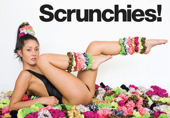
For example, these two, about scrunchies and mini-skirts. Both items that are primarily marketed towards women, for women, and yet the adverts show women in compromising and sexual positions aimed at men. Even female products were targeted towards men.
So for my visual response, my first major idea was to create a sort of anti-campaign for American Apparel, a satire that puts men in these overly sexual positions to show how ridiculous they are:
However, when we had out first feedback session about our visual responses after we'd handed in our essay, Fred pointed out that there wasn't a lot of room for development with this and also that we don't need to have finished outcomes.
So he helped me start developing some new ideas:
- Gender-specific poses/postures: how men and women sit and stand, perhaps in comparison to advertising
- Simplifying/reducing down images of men and women in advertising to just their clothes - how little women wear in comparison to men - i.e. in the American Apparel adverts
For example:
These two are both examples of how advertisers and the media will portray women with fewer clothes - the shirt does not need to be advertised that way on a female model, the male model isn't posing like that.
Here are my notes from the session: